The presence of music in life is becoming increasingly widespread, personally in my life as well.
Nowadays, there are so many music platforms out there, the most popular ones being Spotify, Apple Music and Youtube Music., This made me wonder what other music platforms are out there and why they are not as competitive. After conducting research, I discovered that excluding the problem of lack of resources, the biggest issue is the interface design and way the site is marketed. Therefore, I decided to redesign the webpage for DatPiff, an online platform that focuses on mixtapes, a form of distribution that was developed in the early days of hip-hop and a sentimental and retro representation.
Why The Project
My Role
- Analysis
- Define
- Research
- Design
Duration
2 weeks
Project Overview
DatPiff is an online music platform that focuses on mixtapes, hip-hop, and rap. Through extensive research,I identified three main issues with the DatPiff website: inconsistency between the overall interface design and the theme, hidden information, and undetailed commercial promotions. In this redesign, I will improve the user experience by focusing on these core issues.
Design Process


Analysis
- User Research - User Persona
Define
- User Flow - Information Architecture

Design
- Low&high Fidelity Wireframe

ANALYSIS
Key Problems
The background seems too random and does not match the style
The landing page information is incomplete and does not highlight the theme
No style in the interface design, no hip hop or mixtape elements to be seen
The use of colors is too monotonous
Commercial promotion is not comprehensive enough
Solutions
Use of hip-hop and retro colors to emphasize the style
Promote services and mobile applications of DatPiff
Tweak the interface design and modernize it
Interspersed advertising and promotional media to increase viewer’s attention
Goals
Change the overall layout of the site
Use colors that fit the theme: hip-hop and retro
Reach UI design principle and a better interface
Show important information instead of hiding them
Use landing pages to catch the user's eye: market the site's services and expand commerce
User Research
I conducted a survey with 20 participants. The questions were broken down based on the pain points of the current website.


User Persona
Based on my user research, I created two personas to represent the main user groups.


Define
User Flow
The user flow shows what services and information the users want to get on the website. The flow shows the main problems, targets the goals and solves them through interface design.

Information Architecture

The information architecture (IA) shows where users can find the information and navigation they need within the website. This helped me visualize the construction of the website and hierarchy of information.
DatPiff Original Design

Design
Low Fidelity Wireframe
Low fidelity wireframes helped me to refine my basic ideas and move forward to the final product.


High Fidelity Wireframe

Moodboard

Based on the style of the site I created a mood board to bring me inspiration in design and color.
When designing the hi-fi wireframe, I did research on how to match the style of the website and how to promote the business aspect. The main colors used in the hi-fi wireframe were black with a low transparency wave background as a highlight. The black color reflects a modern feel and the other sections leap in bright color to reflect a hip-hop and retro style.

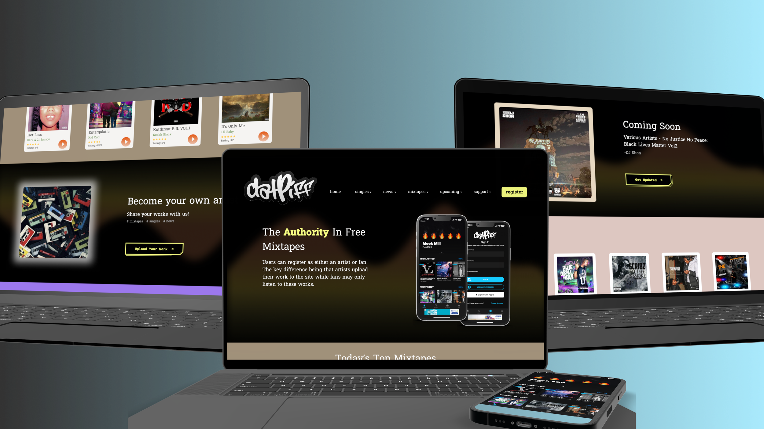
All Screen Display
Style Guide

I created a typography guide to ensure that the hierarchy was preserved throughout the project.
Color Guide
I created color cards to get the exact hues and shades of the colors used throughout the application to ensure consistency with DatPiff’s current design system and corporate branding.

Challenge
The biggest challenge for me during the research process was the fact that the site was created quite early. Since it is a retro and mixtape based site, there is less available information for today's users and therefore less information, such as user feedback, available to me.
What I Learned
Since this was my first website redesign project, I learned a lot about guidelines as well as tips about website design through articles and videos throughout the project. For example, two main principles of design coherence and thematic relevance: web design is something that needs to be approached from a comprehensive perspective, and the design should not be isolated. The design is comprehensive, so that each element in the page has a certain degree of relevance, using the external connection and internal connection of each element in the design to echo each other, to achieve the entire page content and visual integrity and coherence, so that the design of the page is more consistent, aesthetically pleasing and reaches the role of marketing services.
Nest Step
Through this project, I have recognized the importance of the business perspective on a product, such as product thinking and success metrics. I look forward to designing a website for a person or company in the future.